
“Sports logos are avatars of self-identification” – Graphic Designer Matt Wolff
When the task of developing the brand for our new Lansing soccer club was presented to me, I set out to answer a single question:
“Who are we?”
I knew Lansing was the state capital of Michigan. I knew which buildings made up the skyline. I knew the rivers that flowed through town. I knew the handful of teams that had previously represented the city on the pitch. All of this is great surface information, but none of it gets to the heart of what I believe a club should be.
What do we want this club to mean to Lansing? In what ways will this team serve the greater Lansing community?
An important step to finding the answers was setting up branding workshops, held throughout the Lansing community. We invited the public to show up and give their thoughts and share their experiences. Our first goal was to establish our values and characteristics. This would guide how we communicate about ourselves, and mold the more visually tangible elements of our brand.
Through these conversations it became clear that community is the bedrock of what we are trying to accomplish. People don’t just want a soccer team, they want a place where they can express themselves. They want a place where their voice matters. They want a place where they belong.
The next thing to figure out was how to communicate that sense of belonging to those not yet a part of our community. We need to be approachable by not taking ourselves too seriously. It is important that we don’t get too hung up on the soccer side of things. As a reaction to what has previously existed, it became clear that we needed to avoid being overly complicated in our messaging. We needed, and will need to continue to be, relatable.
And without further ado…here is how the final brand reflects our goals and values:
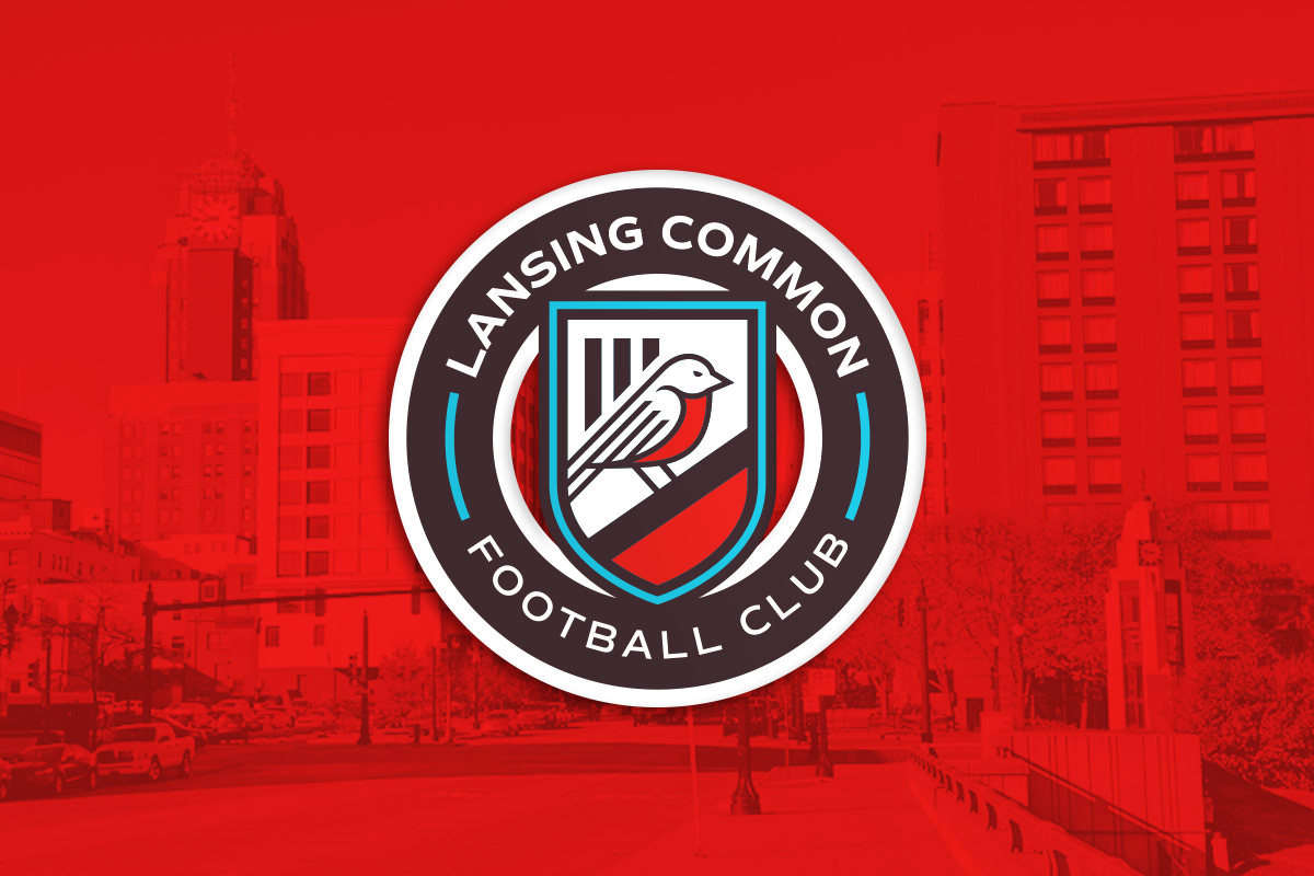
Lansing Common FC
The word “Common” has several definitions. One definition is “belonging equally to, or shared alike by, two or more or all.” Another is “pertaining or belonging equally to an entire community.” Finally, common can be defined simply as “ordinary”. In fact, common is a root of the word community, the greatest of our values.
There is no more perfect name for who we are and what we are trying to build. We are ordinary people coming together to build a community-based club that doesn’t belong to any single individual. Our name reflects our dedication to our mission.
The Robin
The conversation about imagery was predictably the most engaging. People see themselves in their sports teams, and I’ve found that people had very personal reasons for rationalizing their preferences throughout our process. Finding common ground, while focusing on the club as a whole, was the challenge.
After much discussion, and some suggestions that just didn’t feel quite right, we returned to our story and our values. As a club formed to change the way that soccer is approached in this area, could there be a message to send? We soon found a solution: the robin.
The robin, being the state bird, could simply reflect that we are the capital city of Michigan. For most people, that connection would probably be enough. There is, however, a deeper meaning to consider. The first sight of a robin is a sign that winter is coming to an end and that spring is approaching. A robin is a new beginning.
A robin is a new start.
The Stacks
The stacks were a source of debate for many of the people we talked to. Some people think they reflect Lansing’s hardworking people. Some people think they are polluters and give off a dirty feeling. It did not feel like there was going to be a consensus on arguably the most iconic aspect of the Lansing skyline.
Then AJ Badge spoke up and said, “The stacks are all of those things, but to me they mean ‘home’. When I’m driving back to town and I see the stacks, I know I’m close to home.”
Home is the reason why we included the stacks on the crest. Lansing is the home of our club, but it is more than that. We want the club to be a safe and comfortable place for our community. We want this club to be a home for the people of Lansing and beyond.
The Colors
Getting everyone to all agree on a color scheme was going to be nearly impossible, so we had to take a more scientific approach to determining our colors. I compiled every color on the spectrum and did a thorough review of what values they can represent. I then presented these values, without disclosing the colors themselves, to everyone who attended our meetings. This was done so that people would judge the colors solely on their values and their connection to our project. Only after two different color schemes emerged did I reveal the actual colors to the group. In the end, one color scheme rose to the top.
Lansing Common FC are Brown, Red-Orange, and Turquoise.
To my knowledge, we are the only team to wear this color scheme anywhere, let alone in the United States. The brown is a dark, cooling color, yet is warm and inviting. Brown represents community, history, and dependability, which were strong values for our group. The red-orange is intense and eye-catching. It represents the passion of Lansing’s soccer community, the energy of the players, and the joy we get from playing and supporting soccer. The turquoise ties the look together in a refreshing way. It reminds us of a robin’s egg, but it also represents the building of friendships and good fortune.
We are a passionate community built on friendship and belonging.
We are the robin bringing a fresh start.
We are ordinary people trying to do something extraordinary.
We are Lansing Common FC.